Amazon Devices Product Pages Re-invisioned
Redesigned the most important transactional surface for Amazon Devices, simplifying a feature-heavy detail page around a single customer job—launching 14 improvements that drove 1.5M incremental unit sales and a 9-figure revenue lift.
The problem
Over time, the device detail page had accumulated features serving multiple business objectives—conversion, portfolio awareness, and cross-sell—without a clear hierarchy. Customers were bearing the cognitive cost of business complexity: upsell features interrupted product evaluation, accessories appeared in multiple places, and less critical information sat above the content customers needed most to make a purchase decision. The opportunity was to align the organization around a stack-ranked set of business priorities, then redesign the page to reflect that ranking—simplifying the experience around one primary job: getting the right customer to the right device.
My role
I led the strategic and organizational work that made this redesign possible. That meant defining the problem framework before any design work began, aligning the design and research resourcing for this initiative, reviewing work to elevate the design quality, and ensuring design was operating as a strategic partner to product—not an order taker executing a brief.
What I did
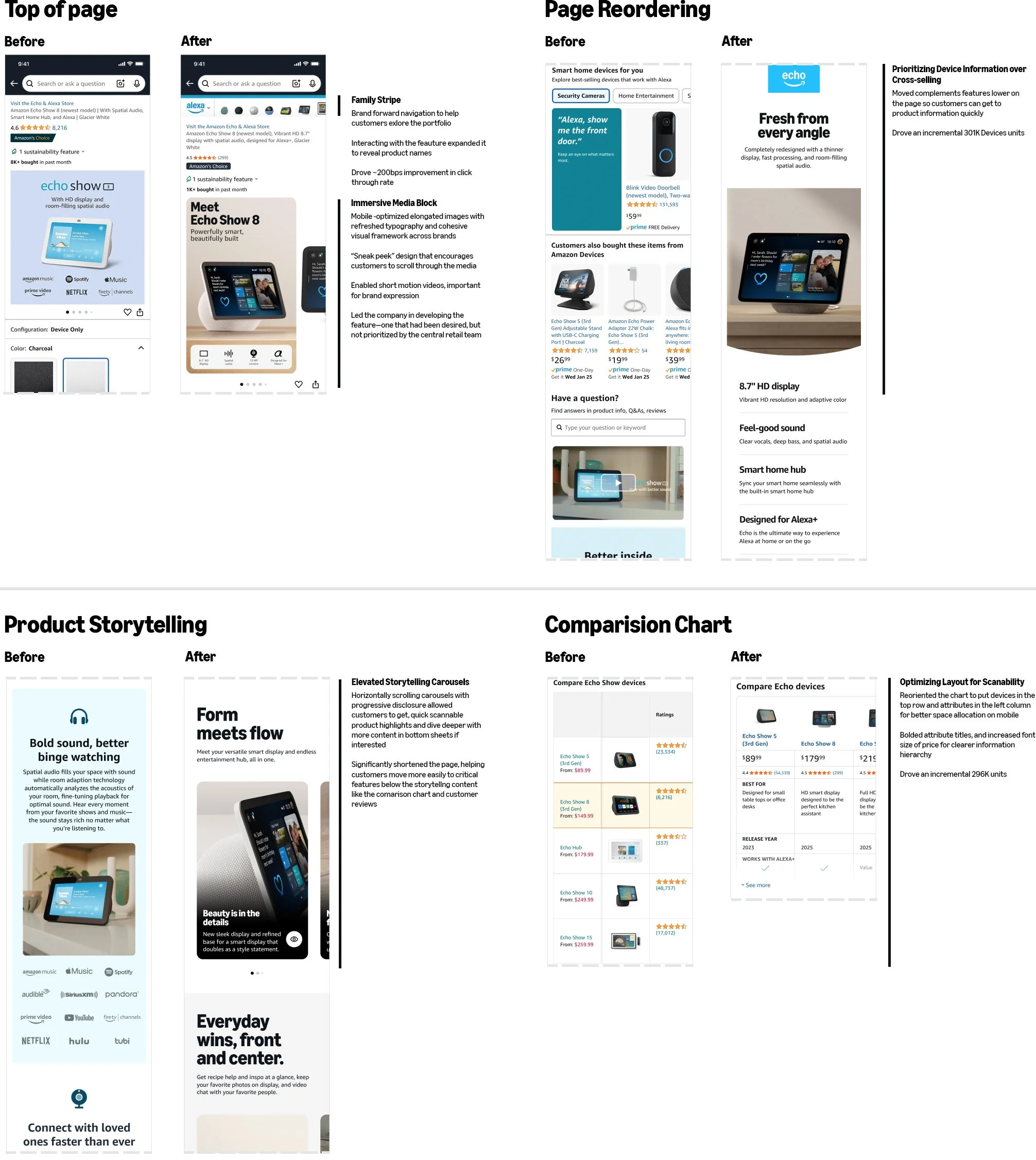
Defined the framework that unlocked alignment. Leadership knew what the pages looked too long and too cluttered, but early debates focused on volume of features and designs of individual features, without on articulation of why that was actually problematic. I audited the page, determining what job each feature was doing, and determined the page had three competing business priorities with no agreed stack ranking. This simplified the problem and helped us frame the conversation around the business priorities. I proposed adopting Amazon's central Zone Framework—grouping like information and customer actions together to reduce context switching—combined with progressive disclosure to reduce visual clutter without removing content some customers would need.
Helped navigate the business priority debate. The top of the page was the highest point of contention, and some stakeholders wanted accessories featured prominently there. I argued that asking customers to consider the ecosystem before they'd committed to the base device was hurting conversion—if they don't buy the device, they can't buy anything else. I proposed consolidating cross-sell into a section below product information and in a focused experience triggered after a customer adds to cart. A/B testing proved the hypothesis: removing upsell features from the top of the page improved base device sales.
Got the customer insights needed to move quickly. I prioritized building a research foundation that would help us resolve debates and focus on customer needs. I partnered with our principal UX researcher to develop a comprehensive, multi-step research program that ran in parallel with design—informing decisions as we made them and validating the direction before we committed. That gave us something to stand behind in every stakeholder conversation.
Structured the team, the cadence, and the delivery model to ship at scale. To deliver at this scope, I restructured the team first—transitioning my senior designer into a lead role directing two mid-level designers and established a rhythm where design and product reached decisions in tandem rather than sequentially. With director-level alignment being our biggest hurdle, I then built a bi-weekly alignment cadence with product management and design leadership, partnering with my product counterpart to bring strategy documents and design work together in themed sessions. Alignment meetings then moved to VPs across Alexa, Kindle, Fire TV, and Ring, and ultimately to the SVP. On the delivery side, I invented a just-in-time model with product and engineering—sharing work at whatever fidelity it was in so engineers could build in parallel, with designers available to resolve specs on the spot—and reframed the entire project as experiment-based, giving the team permission to move toward the Devices fall launch rather than waiting for perfection.
The outcome
Launched 14 improvements to the device detail page in time for the largest Fall launch event to date, driving 1.5M incremental unit sales and a 9-figure revenue lift. The redesigned pages became the foundation for how Amazon Devices presents products to customers, with the framework extending beyond the initial launch surfaces.
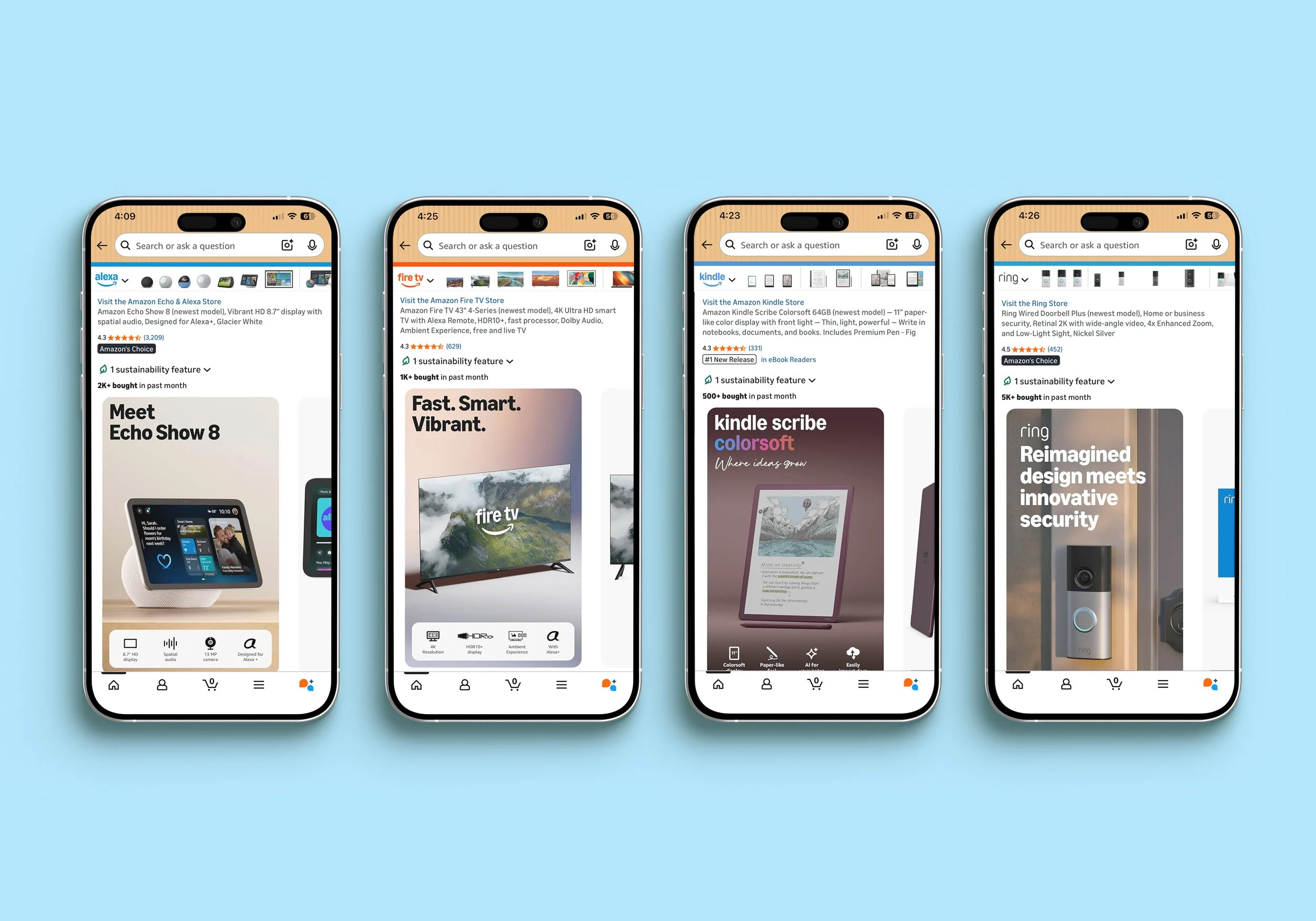
See key, high-impact changes to sections of the page below:
What this demonstrates
This project shows how I work when the problem isn't just a design problem—it's an organizational one. Defining the right framework, aligning competing stakeholders around a shared priority stack, restructuring a team to match the scope of the work, and reinventing how design delivers under pressure are the same moves I'd bring to a retail organization navigating a complex experience overhaul.
What I’d do differently
We invested heavily in the vision work and the SVP presentation—and that investment paid off in terms of alignment. But once executive leadership reviewed the work, the assumption was that we were ready to execute. We weren't. The designs were directionally right but not fully baked—edge cases hadn't been resolved, specs weren't written, and the work wasn't ready to hand to developers. We ended up scrambling through a post-vision gap that we hadn't planned for.
If I were doing this again, I'd set expectations with leadership earlier about what "vision alignment" actually means versus what execution-ready design looks like—and I'd have partnered with my product management counterpart sooner to build a realistic project plan that accounted for the work between those two phases. The lesson isn't to rush the vision—it's to be honest earlier about what comes next and how long it actually takes.