Margaret Darcher
User Experience Designer
Shooq
Social Shopping App
Project Scope
My Role
UX Design
Prototype Development with Proto.io
Branding
Overview: Social commerce involves using social media, online media that supports social interaction, and user contributions to assist in the online buying and selling of products and services.
Problem: Design a mobile social shopping application with product discovery and a direct purchasing system that encourages social shares.
Solution: A mobile app called Shooq. It allows customers to make curated collections of products they would like to buy, to share products with friends, and to make purchases. Shooq partners with retailers to ensure that all products displayed within the app are available for purchase. Users who have added a particular product to a collection are alerted when that product is marked down or if quantities of that product are low.
Research Summary
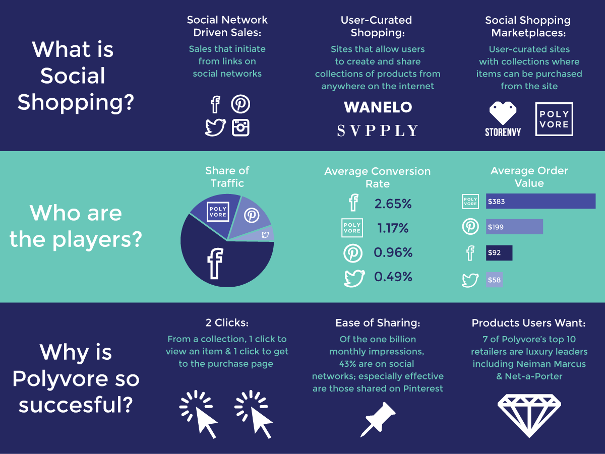
I conducted research on social shopping to see what techniques and platforms currently exist, but most importantly, which ones are most successful. I found that while Polyvore does not lead the market in social shopping transactions, it does lead in average sales. I also noticed that its conversion rate is below the U.S. ecommerce average of 2.5 – 3 percent. The concept and business model of Shooq was driven by a desire to capitalize on what Polyvore is doing well and to improve its conversion rate.
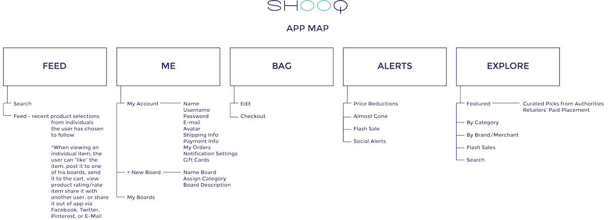
Information Architecture
I prioritized the information architecture based on what tasks users would be most likely to execute. I looked at apps that include similar tasks such as Pinterest and Amazon to inform the architecture as well. In order to keep customers from leaving Shooq, I ensured that all purchases could occur in-app, thus reducing cart abandonment.
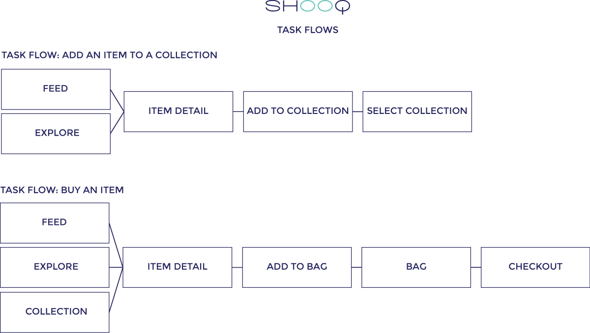
Task Flows
In constructing the task flows, I tried to allow the user to complete her task in as few steps as possible. In order to maximize conversions, I ensured that items could be added to the user’s bag from several different areas of the application.
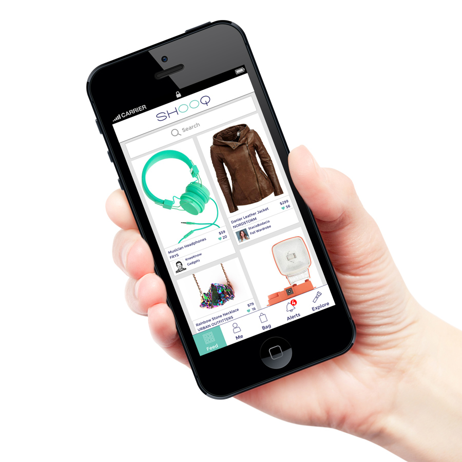
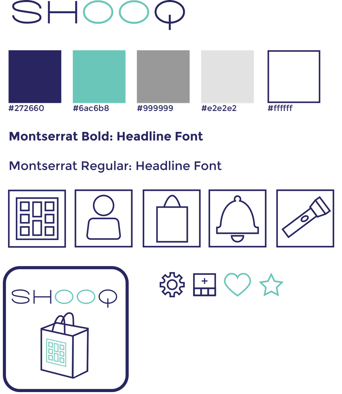
GUI Kit
I designed the user interface kit to be clean and contemporary looking. I choose colors that would feel fresh and appeal to both women and men.
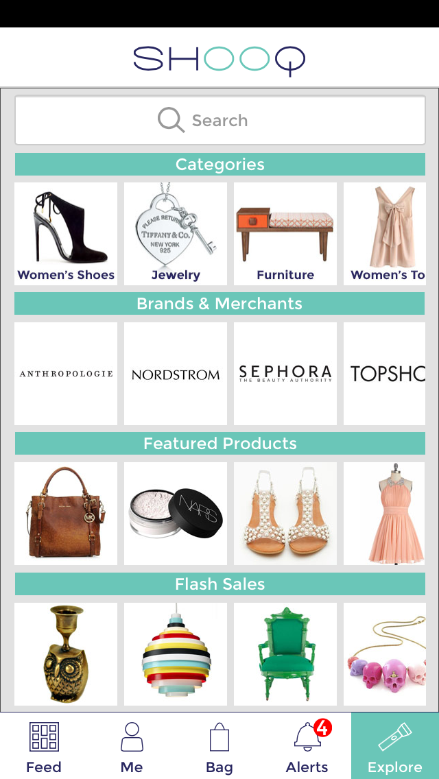
Screen Designs
I designed the screens to closely follow the iOS7 Human Interface Guidelines in order for users to feel familiar with the app. It utilizes a clean, white interface so that the color an imagery of the products become the focus.
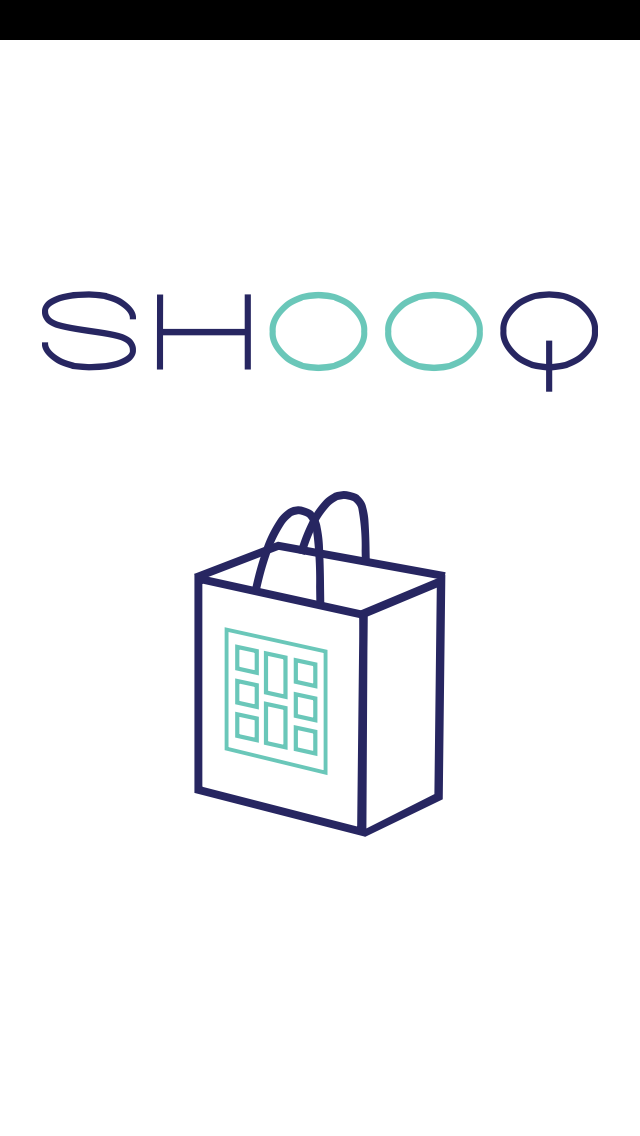
Loading Screen
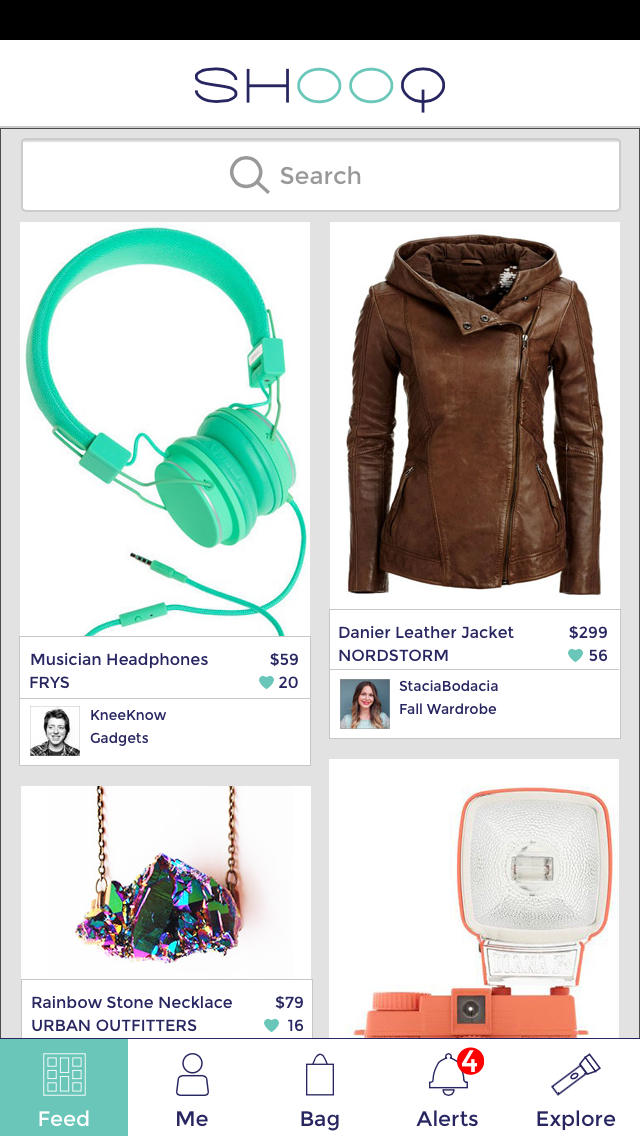
Feed Screen
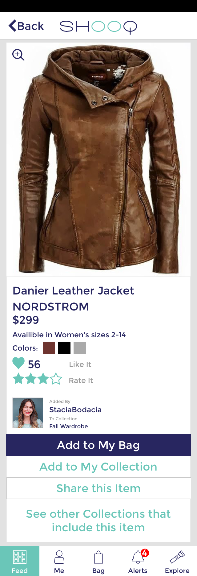
Product Detail Screen
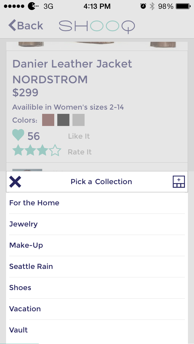
Add Item to Collection Screen
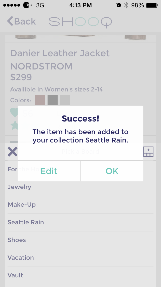
Item Added to Collection Screen
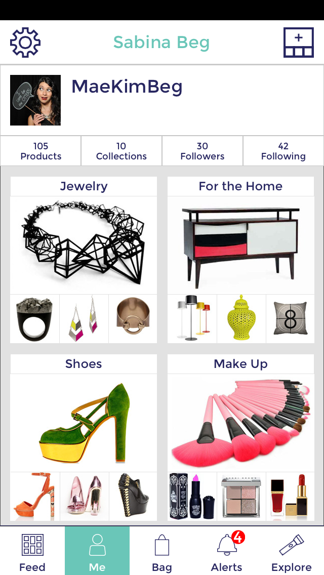
Me Screen
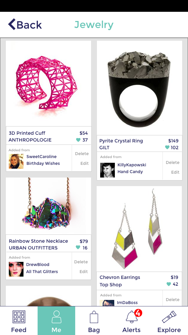
Collection Screen
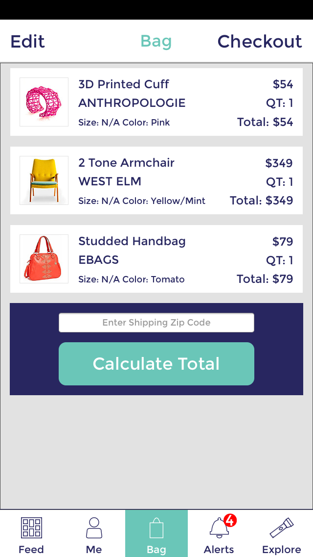
Bag Screen
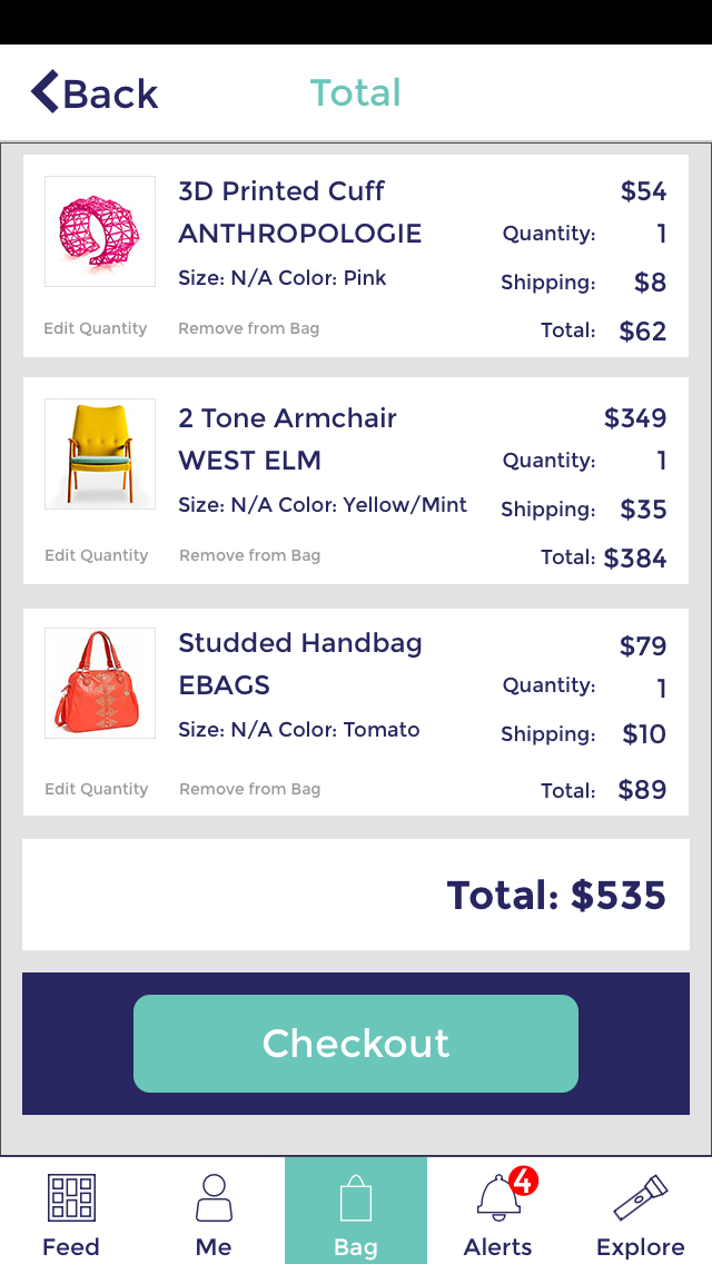
Bag Total Screen
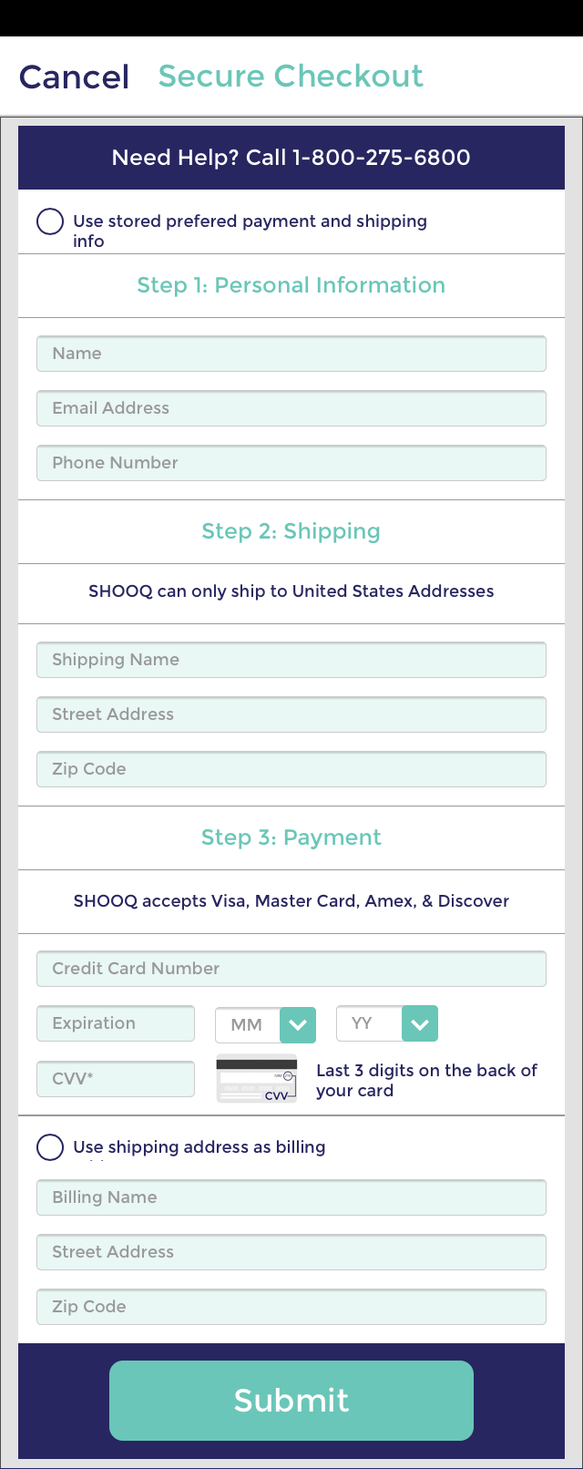
Checkout Screen
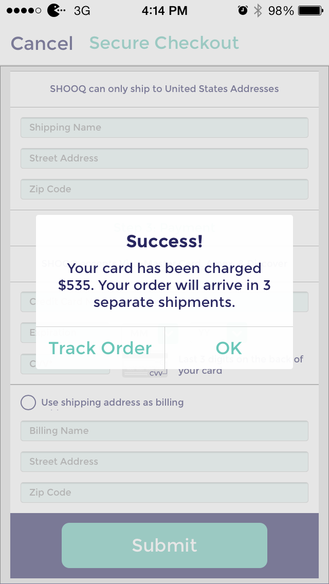
Checkout Confirmation Screen
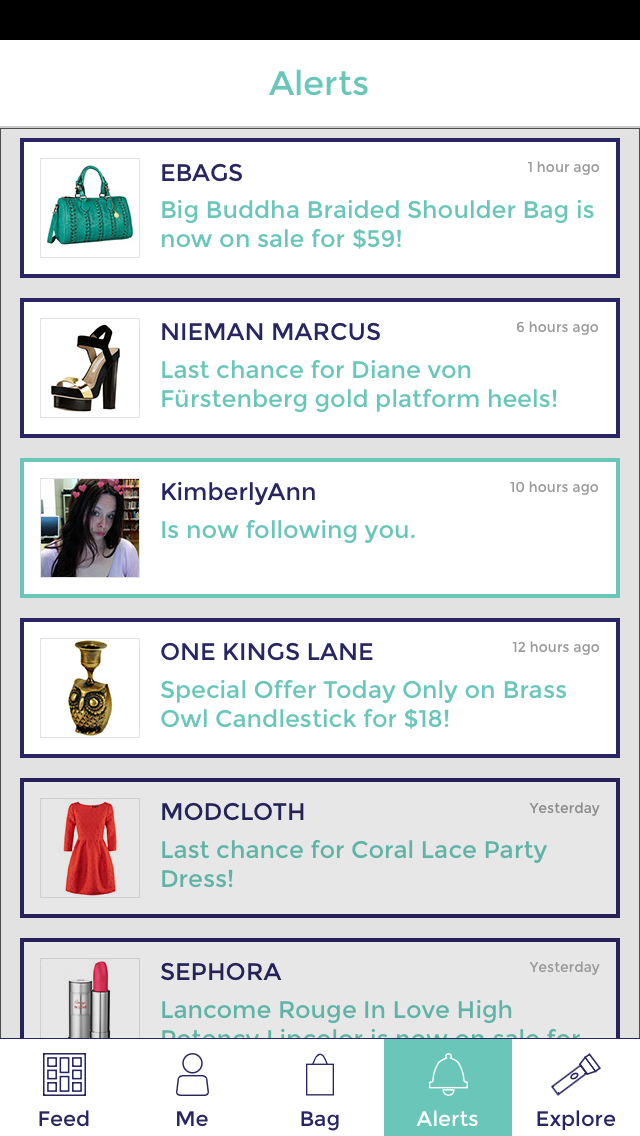
Alerts Screen